Most of us use a mouse and a keyboard to perform every task our computers are capable of, despite the former being a stilted replacement for physical interaction, and the latter being nothing more than a digital typewriter. It really isn’t the ideal setup for photo editing, video slicing, or music production. It’s a bit archaic, really.
It turns out that, for iPad owners at least, there is an alternative. It’s called Actions for iPad, it lives in the App Store, and it has been causing a stir in the tech community as of late, thanks to the innovative touch-based shortcuts and utilities it adds to a Mac or a Windows PC. I went hands-on to see if a £0.69 tablet app is really capable of changing the way we work.[divider]
Installation
Actions for iPad (AfiP) speaks to your Mac or PC via Wi-Fi, so you’ll need to be in range of a network to use this app. You’ll also need to download, install and run AfiP’s desktop server app, a requirement which may make older machines groan, and put off their owners. Modern PCs cope with this small, background app perfectly well, though.
With all the pre-requisites in place, the iPad and server apps need to be paired. Happily, this is a fairly straightforward process that simply involves visiting a given IP address in your iPad browser of choice, and copying across a four-digit code onto your desktop.
Interface
Even in the short period of time it takes to complete the installation, AfiP’s beautiful construction makes itself apparent. Neat black trim coats most of the on-screen surfaces, and every tap is acknowledged with a friendly, quirky sound effect.
Features
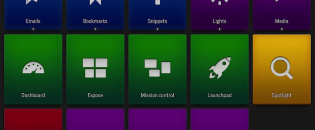
In functional terms, AfiP is pretty simple; it turns an Apple tablet into a dashboard of app shortcuts, extra controls and desktop utilities. However, this doesn’t really describe the potential for workflow streamlining that this app provides.
When working with AfiP, the on-screen workspace is known as a set. Sets can be focused on one app in particular (AfiP scans your computer’s hard drive), but they can also be system-wide.
The functions within each set, called actions — after which the app was named — come in a multitude of different forms.
STREAMLINERS
Shortcut actions replace the keyboard commands that desktop users would normally employ to speed things up. They can be created by inputting the correct key combination and selecting the app it should be applied to. Power users might think that this is hardly worth the hassle, and in most situations they would be right. But in certain desktop apps, particularly in the media editing genre, I think that the accessibility and visual recognition provided by a touchscreen is helpful.
Snippet shortcuts simply hold text, which is pasted when you trigger the action. This definitely speeds things up if there’s something you need to re-type with any frequency.
MEDIA HANDLING
The selection of Media actions includes the six basic controls used with any music or video: Play/Pause, Previous Track, Next Track, Mute, Volume Up and Volume Down. Those of us using an Apple keyboard have these controls at hand, but other folks will no doubt find these options useful.
SYSTEM MANAGEMENT
There are twenty different System actions, which range from Launchpad and Exposé triggers, via the likes of Empty Trash and Force Quit, through to Sleep and a virtual Power Key. Again, power users will probably know the keyboard shortcuts for many of these functions, and some of them are built into Apple keyboards, too. However, with prolonged use, I have found that the Sleep and Lock actions are useful for quick access as you leave your desk.
Most of the Window actions can, again, be replicated speedily on a keyboard, but the resizing and positioning options certainly can’t (even Moom isn’t this easy). These halve the size of the window you’re working on, and move it to the top, bottom, left, or right of the screen, respectively.
WEB STUFF
The Web action just provides one-touch access to a URL, whilst the Email action allows for the pre-setting of the recipient, CC addresses, a subject and the email’s body text, all of which are sent to your desktop’s default email app.
Extra Options
By default, the livery of new actions is black, with the app’s signature lightning icon in the centre. However, a huge library of icons and six alternative colours are on offer to help visually distinguish one action from another. Additionally, stacks of actions can be created; when triggered, these reveal a drop-down sub-menu below the rest of the set.
Sets, themselves, may be customised, as well. The preset layout is a grid that holds fifteen actions, but actions can be made more squat, and doing this makes room for another five. Actions can be rearranged within a Set, but as with an iOS home screen, they are attracted upwards and leftwards — no free drag and drop here, unfortunately.
AfiP does have a couple of extra features up its sleeve, though. Desktop copy and paste merely requires a two-finger swipe, and all actions and sets can be backed up to Dropbox, making the prospect of a clean installation of iOS a far less stressful process.
The Verdict
It’s hard not to enjoy using Actions for iPad. Of course, once you stop playing with it, and start using it for the purposes of getting things done, some of the shine wears off.
But that’s not to say it isn’t an excellent app. The design is superb, and installation is easy. Many of the actions merely replace keyboard shortcuts, but just as many don’t, and with some creativity, it’s possible to build some very useful, touch-triggered automations. It’s also worth noting that the response time to all touch-based commands is surprisingly quick.
In total, then, Actions for iPad is a highly innovative app that is a worthwhile, although not compelling, addition to the desktop setup of any iPad user.
BUY FROM THE APP STORE


